Tutorial ![]()
Admins can view analytics for each assignment. After respondents submit their responses, the system automatically generates analytics for each assignment.
CxO can also view the engagement survey responses.
Note: A minimum of four responses is required to generate analytics. Admins can increase the anonymity threshold above four, but cannot set it below four.
Navigate to Surveys > Engagement.
- Click the engagement survey where you want to view the analytics.
- In the Assignments tab, click Analytics on an assignment.
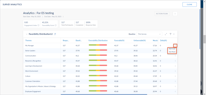
You can view the favorability distribution and heat map on the Analytics page, which is generated based on responses to the agreement choice questions. The driver questions are used to calculate the engagement index. You can create an action plan based on employees' responses.
Favorability distribution
The favorability distribution provides a range of engagement levels for a specific question or section. It gives you a sense of how responses are distributed, indicating the diversity of opinions on a particular aspect of the engagement survey.
The favorability distribution is calculated by the following formula:
Favorability Distribution (FD): Total favorable responses to active agreement choice questions divided by the total number of responses.
Note: Active questions are not hidden.
If you hide the questions, the respondents can view them, and the admins can view their responses. However, responses to the hidden questions are not considered for the favorability distribution scores.
Favourability distribution is calculated for strongly agree and agree options only.
If a respondent selects
- Either strongly agree or agree, the response to that question is marked as favorable.
- Neither agree nor disagree, the response to that question is marked as neutral.
- Either strongly disagree or disagree, the response to that question is marked as unfavorable.
For example, a section has six questions, considering four respondents responded to a question.
- Two responded as either strongly agree or agree, which is favorable. The ratio is 2/4.
- One responded as neither agree nor disagree, which is neutral. The ratio is ¼.
- One responded as strongly disagree or disagree, which is unfavorable. The ratio is ¼.
The ratios are auto-calculated by the system based on the responses.
The following colors indicate the favourability distribution:
- Green is favorable
- Yellow is neutral
- Red is unfavorable

Heat map
A heat map is used to gain insights into various aspects associated with different sections and questions. It represents data by color variations, displaying different functional groups compared to a baseline. This allows you to identify patterns in engagement levels across different departments of the organization.
The system utilizes the baseline as the reference score for calculating the heat map.
For example, the six respondents responded to a survey from the same department.
In a question, the baseline is 41.88%, and their response is +16.67%, which is less than the baseline. The difference score is -25.21%.
If the difference is less than the baseline, the value is represented in the minus sign.
If the difference is more than the baseline, the value is represented in the plus sign.
The less difference is indicated in the light color, while the more is in the dark color.
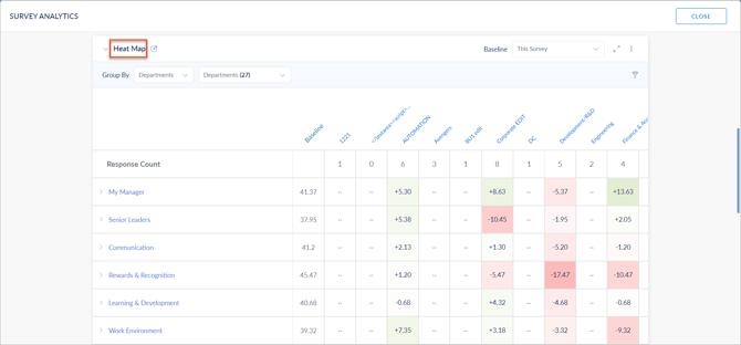
You can create an action plan by adding goals and notes.
Click the cell that has value in it and select Add Goal or Add Note as required.

Engagement index
If you mark any agreement choice questions as driver questions, only they are considered for the engagement index. Respondents have to answer all the driver questions with positive responses: strongly agree or agree to consider them to the engagement index.
For example, if there are ten questions, five are marked as driver questions, considering there are four respondents.
One respondent responded with favorable responses to all the driver questions: strongly agree or agree. The ratio is ¼, which is 25%.
Two respondents responded to two questions with favorable responses and three questions with neutral or unfavorable responses. Their responses are not considered for the engagement index, even though they have answered two questions with favorable responses, indicating their lack of engagement.
Employees should answer all the driver questions positively to show their full engagement within the organization.
The engagement index is calculated by the following formula:
Engagement Index (EI) = Total favorable responses of active driver questions divided by the total number of responses to the driver questions.
Note: Active questions are not hidden.
You can perform the following actions.
Click the Overflow ![]() Menu at the top right and select the option as required.
Menu at the top right and select the option as required.
- Add to Team Pulse: You can select engagement survey questions and add them to Team Pulse.
- Add Distribution Tile: You can add multiple distribution tiles.
- Add Heat Map: You can add multiple heat maps.
- Reorder Tiles: You can reorder the tiles.
- Distribution Score: You can view the section-wise distribution scores.
Adding multiple distribution tiles and heat maps allows you to view and compare the data between different filters.

You can rename each tile as required.
Click the Edit ![]() Icon next to the tile name, type the name, and click outside the box to save the changes.
Icon next to the tile name, type the name, and click outside the box to save the changes.
Action plan
You can create an action plan by adding goals and assigning them to the employees to increase their engagement levels. It allows you easy access to the Goals module.
Click ACTION PLAN at the top right and add goals.
In Favorability Distribution, you can add goals for each question.
In each section, click the Overflow ![]() Menu on the right and select Add Goal.
Menu on the right and select Add Goal.
You can also add notes about the responses for your reference, allowing you easy access to the Notes module.
You can filter the favorability distribution and heat map based on business units, departments, and locations.
You can add the filters to favorability distribution and heat map as required.
Click +Filters on the top right and select the filter.
You can export the tiles to analyze the data if required. The system exports the
- Favorability distribution in Excel format.
- Heat map in PNG format.
Click the Overflow ![]() Menu at the top right in each tile and select Export.
Menu at the top right in each tile and select Export.
Note: You have to expand the sections and questions to download their report.
CxO dashboard
CxO can view the engagement survey responses on their dashboard. They can change the engagement survey to view responses of other engagement surveys.
Navigate to the CxO Dashboard.
- Scroll down to the ENGAGEMENT SURVEY field.
- Click Change Survey beside the name of the engagement survey.
They can access the analytics page and perform the same actions as admins.
Click ANALYTICS at the top right of the ENGAGEMENT SURVEY field.
